One of the benefits of the CoVID pandemic was that a lot of people had a lot more time at home to learn new skills, and one of my roommates bought a Serato DJ deck and started learning to DJ (and taught me a bit about it as well). As he consistently practiced nearly every day for at least an hour and would often live stream his DJ sets and joined a DJ community within the city, he became consistently very good with his transitions, curating the songs for his sets, and he had the desire to continue practicing and create a DJ name, brand, and LLC around his DJ skills.
As his birthday was approaching, and he had already told us what DJ name he was planning to use, I decided to take this on as a part-time branding project during the span of a few weekends so that we could gift him with a unique and memorable brand.
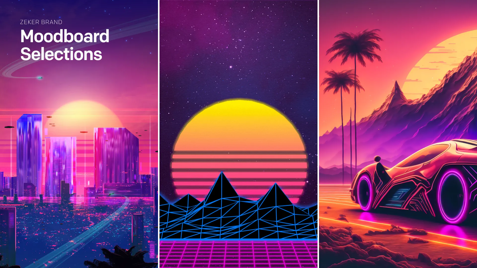
Initial Moodboard
I started off like most identity projects by asking the client to provide me with some adjectives and images that could help describe his brand (so that I could create a moodboard to understand the visual and emotive direction). After settling on the direction (bold, synthwave/retro) and knowing the meaning of the Dutch word “Zeker” which essentially translates to “Assuredly”, “Beyond Doubt”, and according to my friend “Unquestioning Confidence”.
Logotype Decisions
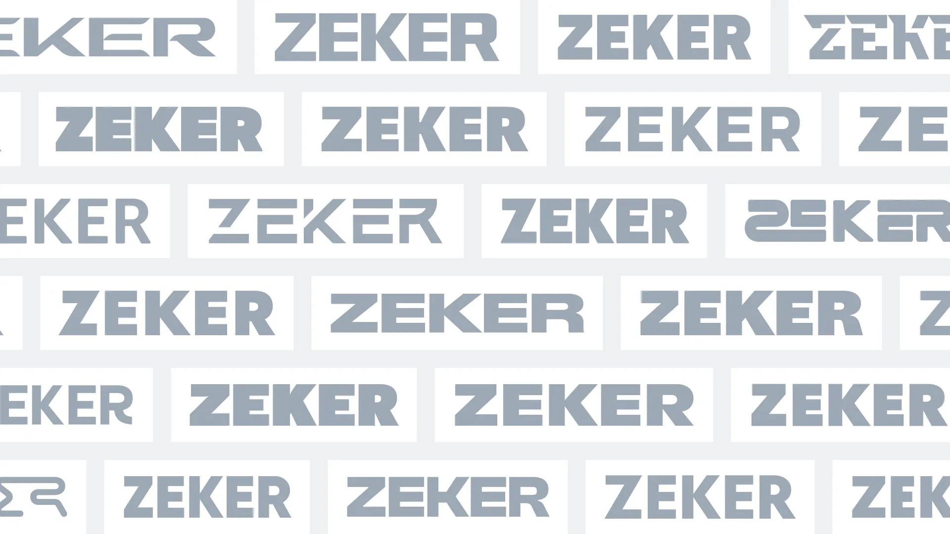
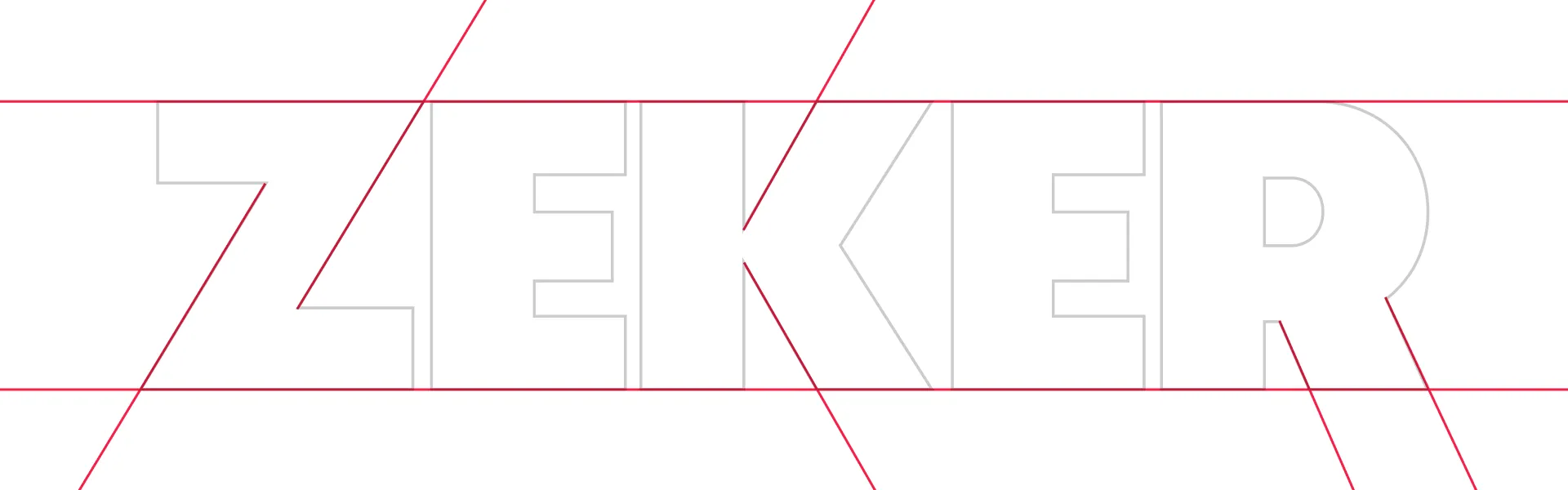
I decided that the typeface should be extremely bold and easily recognizable and should lean into the typgoraphic characteristics of the letters—all of which have dynamic, straight lines that would help convey that same assuredness.
After working with the client and settling on a few fat face options, I then presented them with various options of framing the logotype. Ultimately we settled on a double-line rectangular framing for the logo.
Square Symbol Variation
For DJs as well as most brands with an online presence, having a logotype is typically only half of the final brand presentation, as many need a way to present themselves in avatars, on social media, etc.
![]()
I focused on the letter Z and added diagonals to emphasize the movement of the diagonal stroke, to depict the Z is lifting everything up and to the right. The client liked it so much he wanted it added to the full text color logomark, which I thought helped differentiate it from a standard rectangle.
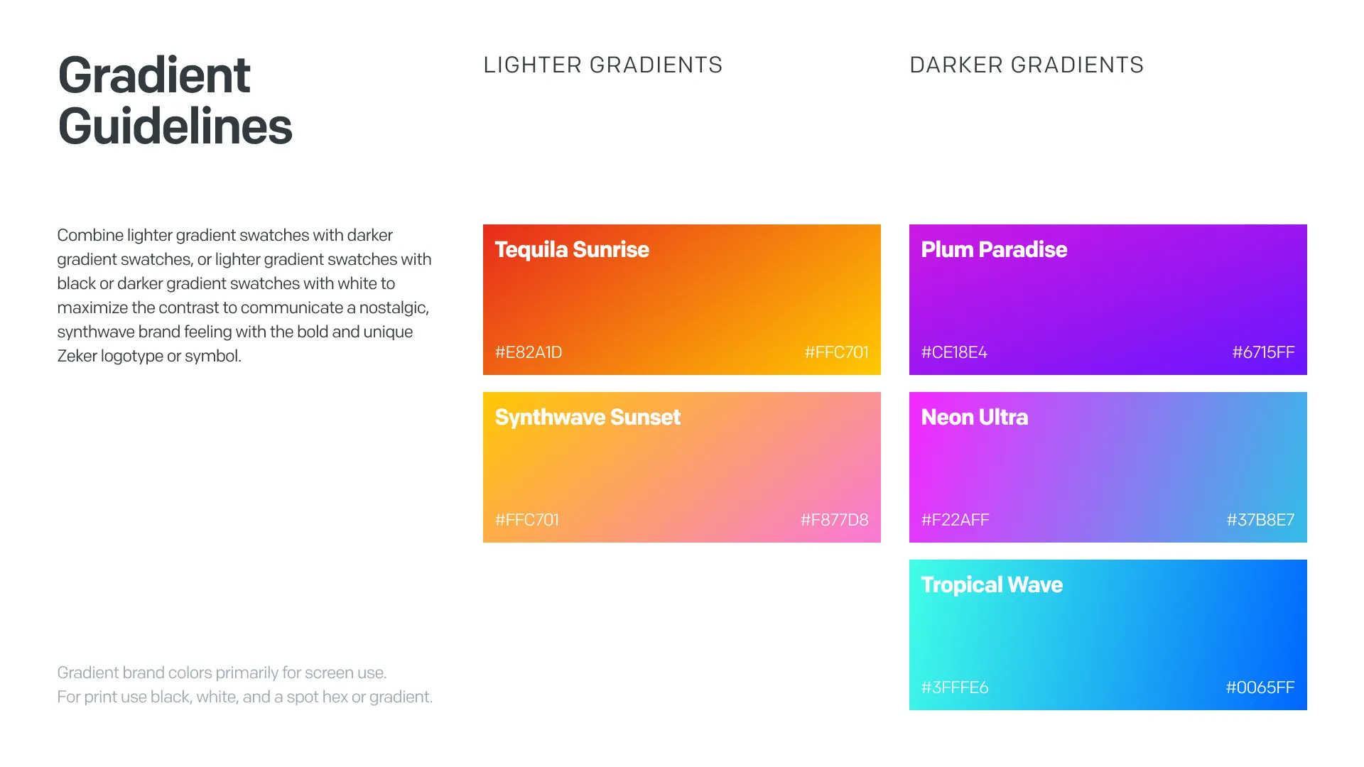
Brand Color
I used sunset tones typically found in synthwave and retro imagery to find solid tones and gradients that would work well for the brand color. Ultimately, we decided on a gradient fill for the logotype that would contrast in direction and hue with the gradient fill of the framing strokes, so that the color patterns could stand “assuredly” and “beyond doubt” within the bold logo.
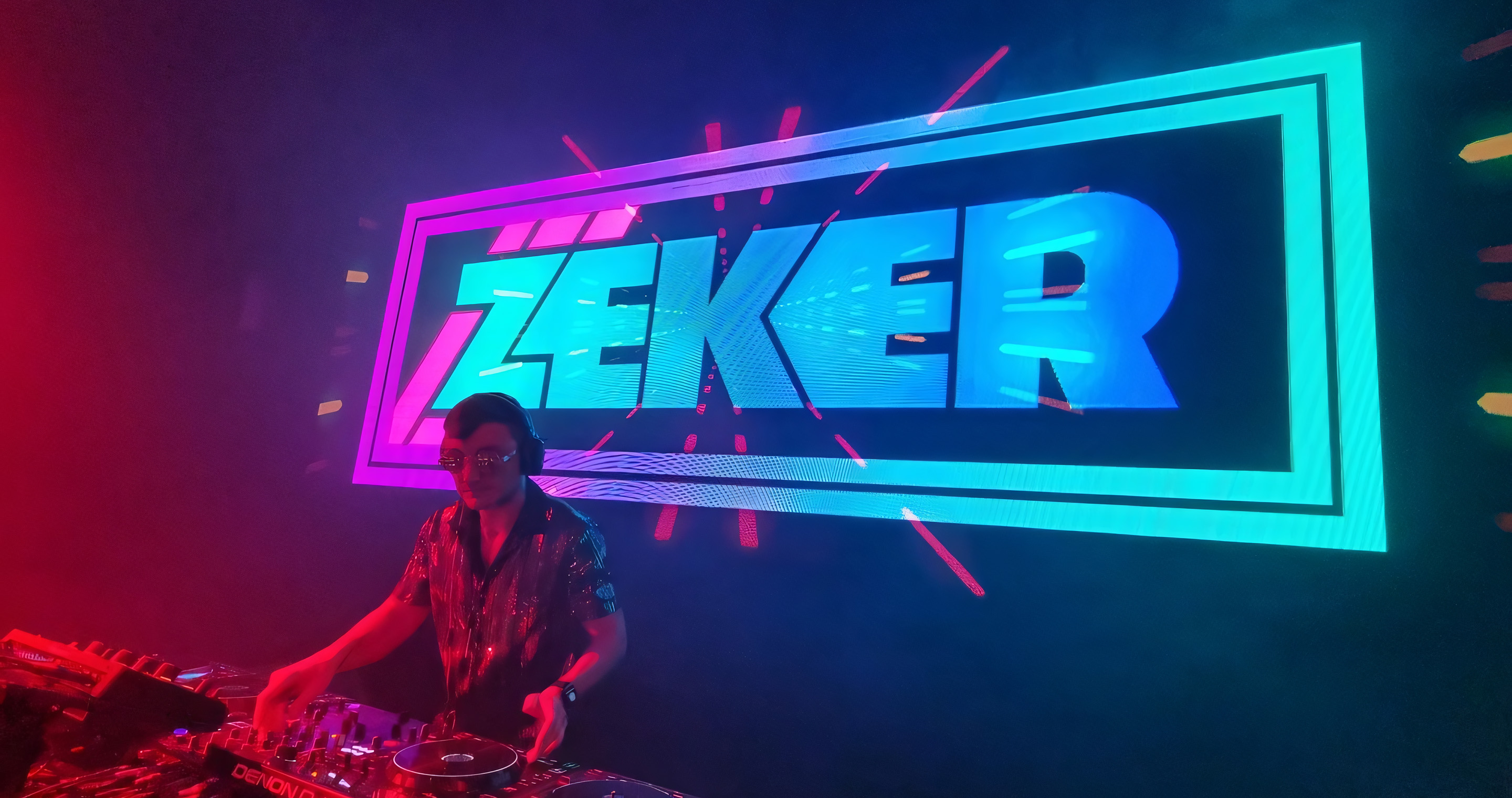
In Final Form
The client loved the final production of the Zeker logo and was excited to start using it in his performances. The final touch was presenting the client with the Zeker logo on a new pair of professional headphones for him to use while on the decks.